How to Build a Wedding Planner Website That Books Consultations
By Jeferson Bruno · June 3, 2026 · 9 min read
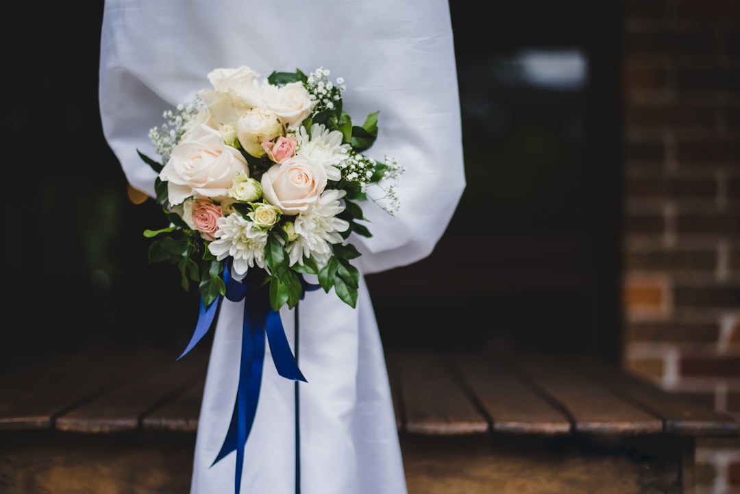
Here is what happens the week someone gets engaged: they scream, they call their mom, and within about 48 hours they are deep in Google and Instagram looking at local wedding planners. They are not reading your bio yet. They are looking at your real weddings, trying to picture their own day in your work. By the time they fill out a contact form, they have already half-decided you are the one — or they have quietly clicked away to the planner whose website made them feel something.
That is the whole game, and it is why so many talented planners lose bookings they should have won. Your referrals are strong, your day-of coordination is flawless, your couples adore you — but your website is a stale template with three blurry photos, no pricing hints, and a contact form that dumps into an inbox you check on Tuesdays. Couples planning the biggest party of their lives need to feel organized and cared for before they ever pay you a dollar. A messy site signals a messy planner, fair or not.
The good news: a wedding planner website is one of the most straightforward small-business sites to get right, because couples want the same handful of things every time. This guide walks through exactly what to build, in what order, and how to make it feel romantic without looking like an amateur ran it out of a shoebox.
Lead with real weddings, not stock photos
The single most important thing on a wedding planner's website is a portfolio of real weddings you actually planned. Couples can spot a stock photo of a picture-perfect tablescape from a mile away, and it does the opposite of what you want — it makes you look like you have nothing of your own to show.
Build a gallery organized the way couples think, not the way you file things. A few ways that tend to work well:
- By venue type — barn, ballroom, backyard, vineyard, city rooftop. A couple who booked a rustic venue wants to see you have done rustic before.
- By full wedding story — instead of one giant grid, give a handful of weddings their own mini-page: the couple's names, the venue, a short paragraph on what you pulled off, and 10 to 15 photos that flow from getting-ready to the last dance.
- By season or style — moody fall florals versus bright spring garden weddings read very differently.
One honest warning: always get permission and photo credit right. Wedding photographers own their images, and using them without credit is both a legal risk and a fast way to burn a referral relationship you probably want to keep.
Spell out your packages — full, partial, and day-of
Nothing loses a lead faster than a couple who cannot tell whether they can afford you. You do not have to publish exact prices (many planners do not), but you absolutely should explain what each level of service includes so couples can self-select before they book a consult. That filtering saves you hours of calls with people who wanted a $2,000 coordinator when you are a $12,000 full-service planner.
Lay out three tiers in plain language:
- Full planning — you are involved from engagement to send-off: budget, venue search, vendor sourcing, design, timeline, the works. Describe it as the hands-off option for busy couples.
- Partial planning — the couple has a head start and you take the reins partway through. Be specific about where you pick up (usually a few months out).
- Day-of coordination — you honestly should call it "month-of," because real coordination starts weeks before. Explain that this is execution, not planning, so couples do not expect design help they are not paying for.
If you offer a starting price, a simple "full planning begins at $X" line dramatically improves lead quality. If you would rather not, add "most couples invest between X and Y" so nobody arrives at the consult shocked.
Let couples do the selling with testimonials
Your words about yourself are marketing. A past couple's words about you are proof. Wedding decisions are emotional and high-stakes, so testimonials carry unusual weight here — a nervous bride reading "she caught a vendor's mistake I never would have seen and saved our timeline" is worth ten adjectives you could write about yourself.
Make your testimonials land harder with a few habits:
- Use real names and a photo — "Sarah & James, Oak Hill Vineyard, October 2025" beats "S.J., verified client" every time.
- Pick specific stories over generic praise — "amazing to work with" says nothing; "our caterer canceled two weeks out and she had a replacement booked in a day" sells you.
- Place them next to the matching wedding — a quote sitting beside the couple's actual gallery photos feels real in a way a wall of quotes never does.
If you have reviews on Google or a wedding marketplace, pull the best lines onto your own site. Do not make couples leave to go find them.
Publish your vendor list — it signals you are the real deal
A dedicated vendors or "preferred partners" section does quiet, powerful work. To an engaged couple, a planner with a deep bench of photographers, florists, caterers, DJs, and venues reads as established and connected — someone who can actually deliver, not someone figuring it out as they go.
It works in both directions, too. Vendors notice when you feature and link to them, and that goodwill turns into referrals headed your way. A few tips:
- Group vendors by category so a couple hunting for a florist can scan quickly.
- Add a short line on why you love working with each one — it shows taste, not just a phone book.
- Keep it current. A dead link to a florist who closed in 2023 undercuts the whole "organized professional" image you are building.
If you are just starting and your list is thin, that is fine — feature the vendors you have worked with honestly rather than padding it with names you have never met.
Make booking a consultation frictionless
Every page you have built so far exists to drive one action: booking a consultation call. If that step is clunky, all the beautiful galleries in the world will not save the conversion. The classic mistake is a bare contact form that vanishes into an email inbox — the couple has no idea if you got it, when you will reply, or what happens next.
Tighten the whole path:
- Put a clear call-to-action on every page — a persistent "Book a Consultation" button so a couple who falls in love with a gallery on page four does not have to hunt for how to reach you.
- Ask the right questions up front — wedding date, venue (or "still looking"), rough guest count, and which package caught their eye. That handful of fields tells you if they are a real fit before you spend an hour on a call.
- Set expectations after they submit — a simple "Thanks! I reply to every inquiry within 48 hours" message reassures an anxious couple that they are in good hands.
- Consider a scheduling link so they can grab a time instantly instead of playing email tag with someone planning around a full-time job.
You can wire all of this up on a wedding planning business website without touching code — the point is to remove every reason a ready-to-book couple might hesitate.
Strike the romantic-but-professional balance
Wedding sites tend to fail in one of two directions. Too romantic and it is all script fonts, blush overlays, and dreamy copy with no substance — pretty, but it does not answer a single practical question. Too corporate and it feels like a law firm booked your wedding by accident — trustworthy, but cold, and weddings are nothing if not emotional.
The sweet spot borrows from both:
- Let the photography carry the emotion. Your real weddings already do the romantic heavy lifting, so your text can stay clear and confident instead of drowning in adjectives.
- Pick one elegant serif or a tasteful script for headings, and a clean readable font for body text. Never set paragraphs in a script font — it looks lovely and reads terribly.
- Keep it fast and mobile-first. Couples browse planners from bed at 11pm on their phones. A gorgeous site that takes eight seconds to load loses them before the first photo appears.
- Say what you actually do. Confidence reassures couples far more than flowery promises — "I manage your budget, your timeline, and every vendor so you can be a guest at your own wedding" beats a paragraph of poetry.
When you are ready to put it together, you can build your site free and have a warm, polished planner site live the same afternoon — no designer, no monthly template fees, no code.
Frequently asked questions
Do I need to list my wedding planning prices on my website?
You do not have to publish exact prices, and many planners choose not to. But you should give couples enough to self-select — either a starting price ("full planning begins at $X") or a range ("most couples invest between X and Y"). Even a rough figure filters out mismatched leads and means the couples who book a consult already know they can work with you, which saves everyone time.
What pages does a wedding planner website actually need?
At a minimum: a home page that leads with your real weddings, a portfolio or gallery, a services/packages page explaining full, partial, and day-of coordination, an about page so couples connect with you personally, testimonials from past couples, and a clear contact or consultation-booking page. A preferred-vendor list is a strong optional addition that signals you are established and connected.
Can I use photos from weddings I planned on my site?
Only with permission. Wedding photographers own the copyright to their images, so you need their okay to use them and you should always credit them by name or link. Most photographers are happy to say yes — you are showcasing their work too — but using photos without asking is both a legal risk and a fast way to damage a vendor relationship you want to keep.
Ready to put your business online?
Build your website in minutes — free to start.
Build my free website